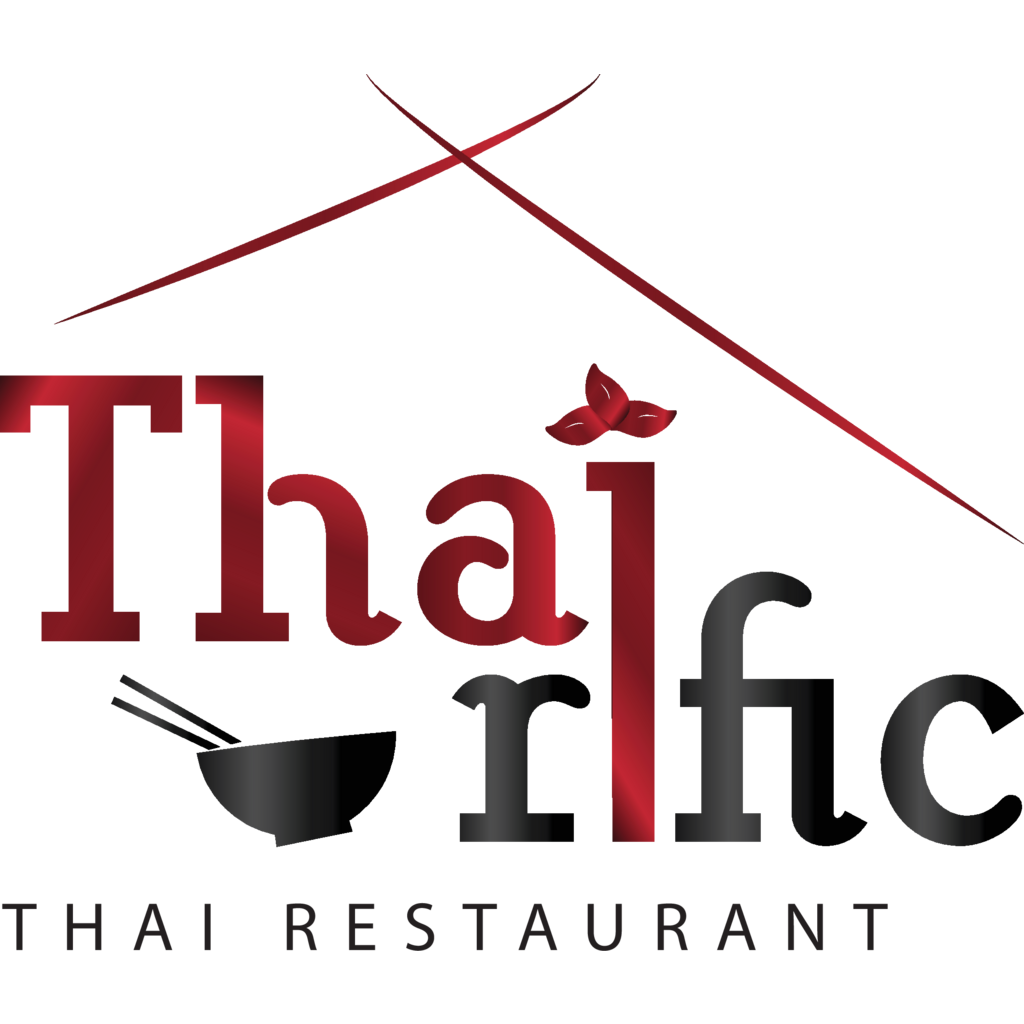
I tried to make it simple yet, classy to look at. The client wanted me to put some elements such as spices, noodles etc. to make it more look "thai-ish" that is why I replace the dot on the letter "I" to a basil leaves and put a bowl on the bottom left for balance i guess. however i feel that there is something wrong with my logo. it's either i should remove something or change something. honest critics will be highly appreciated. Thank you!